Studio Review Week (SRW)
Logo design
Logo design
The limited-time event invites you to explore and celebrate the vibrant creativity of design studios from Puerto Rico. This week-long exhibition showcases the region's rich design talent, featuring innovative works from emerging and established designers.
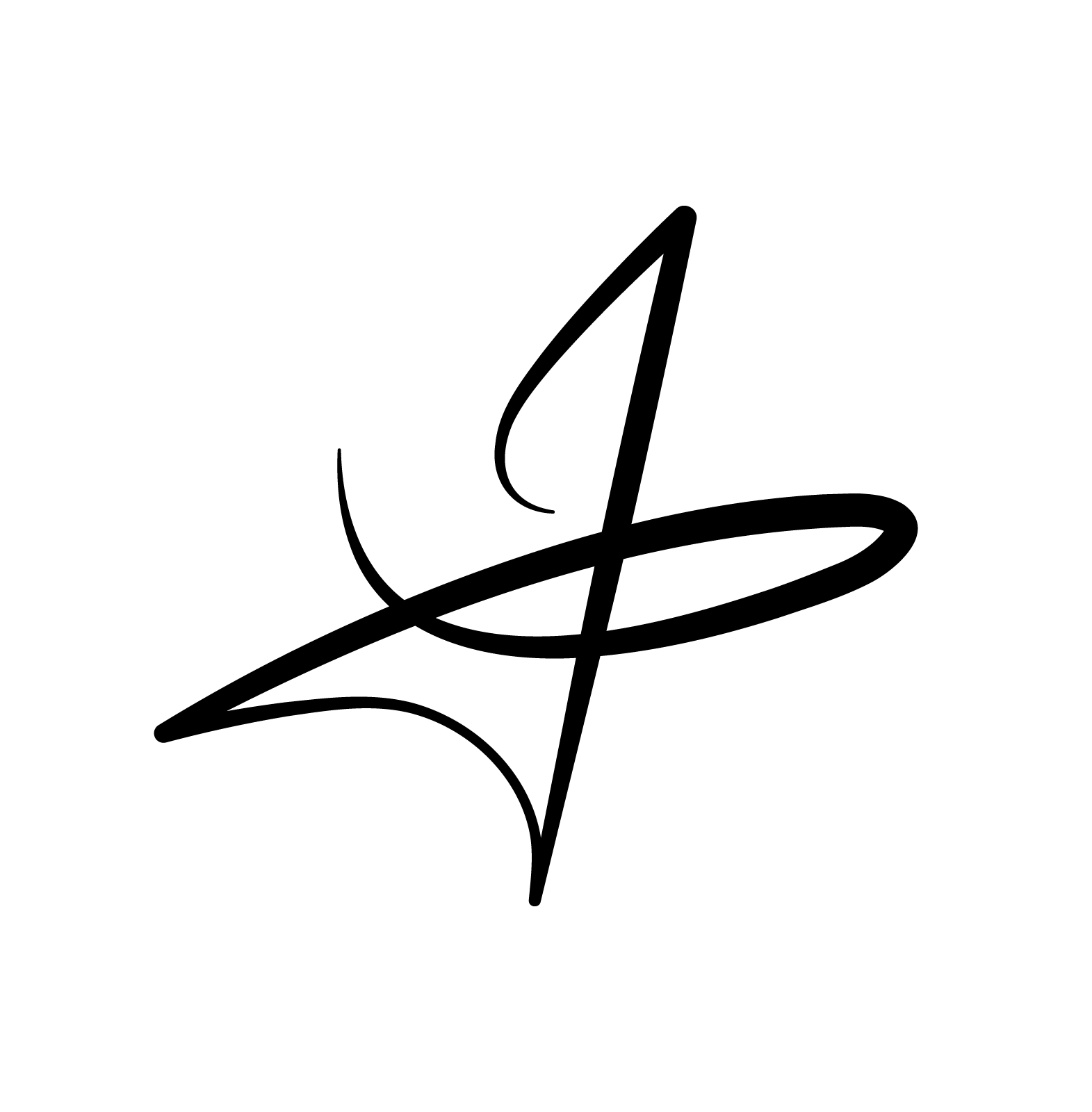
The logo for Studio Review Week is a masterful combination of simplicity and symbolism. It integrates the initials S, R, and W (representing Studio Review Week) into a single, cohesive design. The “S” and “R” form the upper structure of the logo, while the “W” is cleverly embedded into the downward-pointing arrow element.
The color Rubine Red is the ideal choice for Studio Review Week as it embodies creativity, energy, and bold expression. This decision perfectly aligns with the event's celebration of Puerto Rican design studios.


